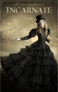
Those of you who follow me on Twitter have probably already seen at least one version of the cover for my forthcoming Edwardian-set urban fantasy (you can read the first scene of the book here). I’ve been positively giddy about the art for this book ever since Nathalia Suellen agreed to do the work for a price that was within my price range.
Nathalia’s work came to my attention a few months ago when Harper Collins “cribbed” the art she had previously sold to LK Rigel for a book titled Spiderwork to use on an Alex Flinn book; they’ve since changed the cover, but the story can be read at Dear Author. As I was perusing Nathalia’s portfolio, I didn’t really expect to find anything that would be appropriate for my books because she specializes in artwork of a fairly “fantastical” variety and most of my stories are pretty solidly grounded in the real world. But then I came across this image:

Immediately, I thought of INCARNATE, an urban fantasy set in 1902 London that I’d written about 15,000 words of. This picture immediately made me think of the book’s heroine, Elodie. I loved her jaunty pose and the eerie city in the fog. The dress and top hat seemed perfect for the period as well as for the character. I loved it so much, I actually mocked up a cover based on it, just because I had to SEE it with my name and book title on it.
I contacted Nathalia almost immediately and was crushed to discover that the artwork in question had been done on commission and was not available for sale. My heart broke, because I was sure that was the end of it. But then Nathalia offered to do the cover from scratch for me, and I jumped at the offer. Even though the book was well short of complete (and still is), I couldn’t let the chance slip by, especially since I’m convinced Nathalia is so talented, her work is going to be out of my price range before much longer. (When the major publishers get a gander at the cover she’s done for me, I think they’re going to be beating down her door!)
The basic parameters of the cover were set by the original piece I’d been interested in. The female model would have a black dress and a top hat. The color palette would be primarily black and sepia. I turned the project over to Nathalia and waited with great impatience to see what she would come up with.
The first draft came in mid-October:

I was floored, but there were a few minor problems. First and foremost was the fact that the heroine of INCARNATE has dark hair and the cover model here is blonde. I also thought it would be nice to have something in the background that gave a sense of setting, so I suggested a recognizably London city-scape would be good. Finally, Beverley Kendall felt that the model’s face is perhaps a trifle too pale, and when I thought about it, I agreed. I sent Nathalia my list of changes and waited.
When the next version came and I opened the file, my heart literally skipped a beat.

I was stunned. Just floored. If the first version was wonderful, this was beyond my wildest dreams. It perfectly captured the mood I wanted for the book. There were just a few MINOR issues, mainly that I wanted my name to be bigger and I realized that in addition to the tagline, I needed something on the cover to indicate the book is the first in a series. I figured this would just be a matter of changing type sizes and moving some stuff around, and that the next version would look almost identical to this one.
Um, wrong. Because Nathalia upped her game AGAIN:

Can I say WOW? Just holy ZOMG WOW!
Now, of course, I’m feeling a lot of pressure to make sure the book I’m writing lives up to this amazing cover. As I mentioned up-thread, I’ve written the first 15,000 words (about 20% of the story), but I still have to complete The Lesson Plan, which is already more than a month behind schedule due to my new second career as my children’s chauffer. I’d love to be able to say I know exactly when the book will drop, but the truth is, I don’t want to over-promise and under-deliver, so I’m going to guess it’ll be no later than fall of 2012, with my fingers crossed for summer.
Wish me luck!
Wow, that is a gorgeous cover! Love it.
It’s an absolutely stunning cover, Jackie!
That cover is amazing. I am just…stunned. I can’t wait for the book now! 😀 Good luck with your progress–I can’t wait to read it!
I totally don’t like you anymore. You understand why, right??!!!
Bev
Drifting in my own ENVY purgatory.
[…] Romance writer Jackie Barbosa has a neat post on the evolution of a cover which shows the inspirational image through to the finished product for her Edwardian-set urban […]
Clearly I’m not spending enough time on twitter! I hadn’t seen any of these covers. The first is lovely. The last one is truly amazing!
Jackie – all these covers are awesome, but the last one pops! Thank you for showing us how these designs progress. I’ve always wondered 🙂
~Kristine
That is one beautiful cover Jackie!
GORGEOUS! And how exited am I for your new project? Very! 🙂 Good luck with carving out the writing time, I know how that feels~
your website is amazing. I cant wait for reading this too. sucess and all the best!